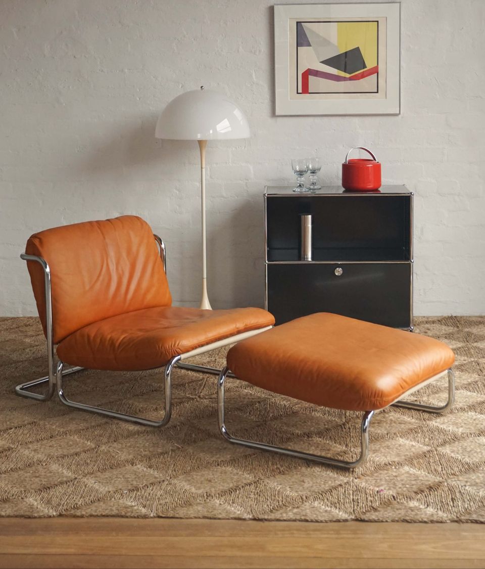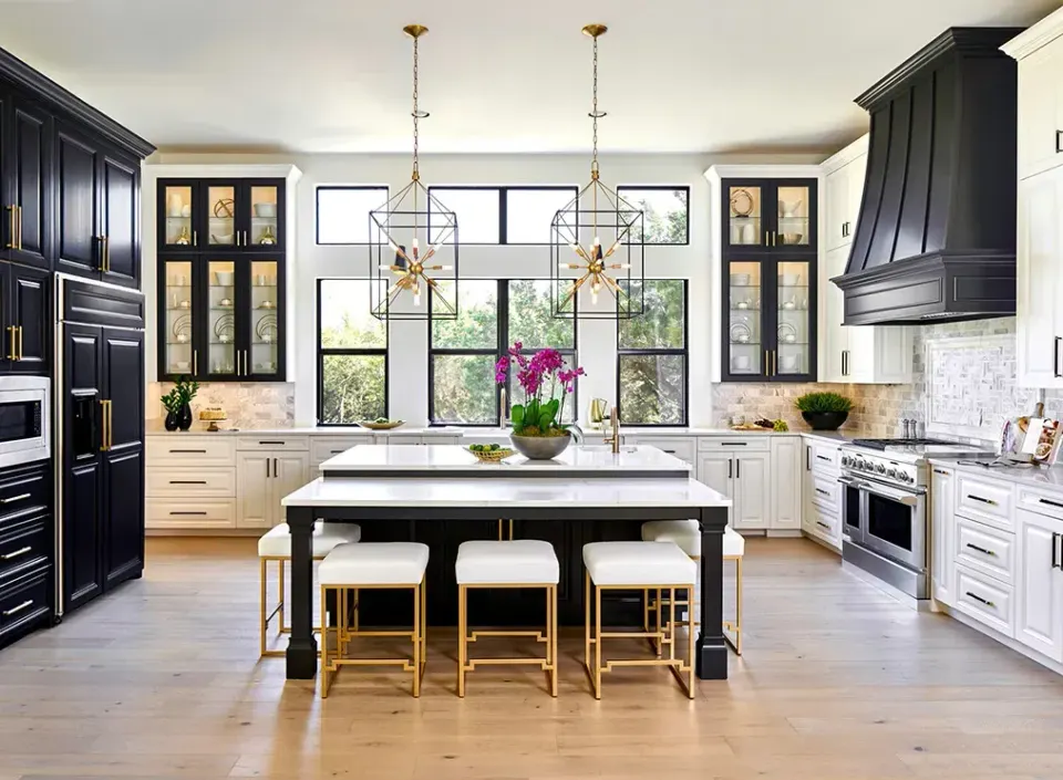
Warm Earthy Interior Colours 2026: How to Use Ochre, Clay and Caramel at Home
Ochre, clay and caramel are Dulux's 2026 earth tones. Here is how to use them with Pantone's Cloud Dancer white, and how to try them before a spring repaint.
Warm earthy interior colours 2026 have arrived in Australian homes, with ochre, clay and caramel leading the palette and a soft white, Pantone's Cloud Dancer, sitting calmly beside them. With spring repaint season here, this is how to use them without committing a whole house to a trend.
The 2026 colours, in plain English
Dulux's 2026 colour forecast is built around what it calls tenderness and connection through colour, and it splits into three palettes. Two matter here. The Evoke palette is the bolder one, with earthy pinks, warm mustards and golds, and a deeper dash of berry. The Elemental palette is the calmer one, built on warm whites and neutrals warmed with golden browns.
Three named colours cover the look. Baked Clay is the terracotta-leaning orange, a soft clay that works on a wall as comfortably as it does on a pot. Condiment is the ochre, a deeper golden tone. Caramel Sundae is the caramel, a mid-tone brown that reads as warm rather than heavy.
Where Cloud Dancer fits
Pantone's 2026 Colour of the Year, Cloud Dancer (11-4201), is a soft, airy white rather than a stark one. That is exactly why it works with the earth tones above. Designers describe it as a backdrop, best on walls, ceilings and built-ins, and best paired with natural timber, linen, wool and warm metals such as brass.
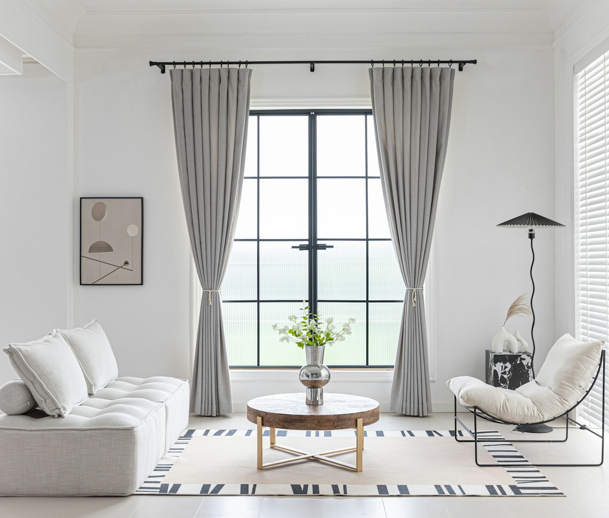
The practical rule is to keep the walls quiet and let one warm colour do the talking. A white room with a caramel armchair or an ochre cushion reads as deliberate. A white room with four competing earth tones is a mood board.
Try it before you repaint
Dark, warm colours shift a lot with the light, so test before you buy. Dulux sells A4 colour swatches and 100ml sample pots, and its own advice is to look at a colour in natural light at different times of day, and at night under lamps and downlights. Put swatches on two walls in the room and live with them for a few days before deciding.
Rental-friendly ways to borrow the look
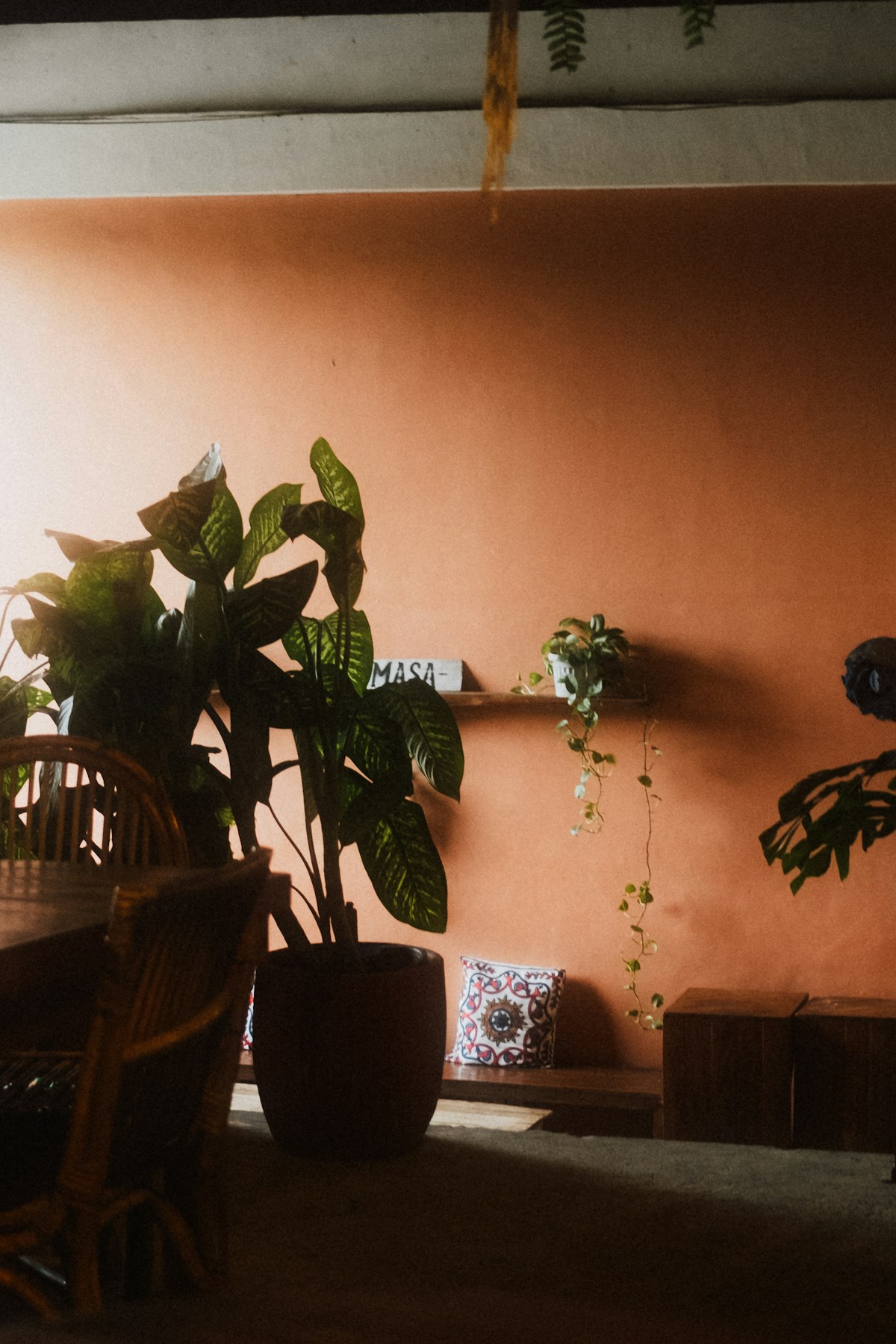
If you rent, check your lease before you paint, and keep to changes you can undo. These are the easiest ways to get the colour without touching the walls:
- Textiles: a caramel throw, ochre cushions or a clay-coloured linen cover change a room faster than any paint chart.
- Rugs: a warm-toned rug anchors a white or neutral room and travels with you when you move.
- Peel-and-stick wallpaper: Australian-made options such as Olive et Oriel's removable range are sold as renter-friendly. Order a sample first, and test a small patch somewhere hidden.
- Plants and pots: terracotta pots and green leaves look very good against a warm wall or a white one.
- Lamps: a warm bulb and a linen shade make every earth tone look better at night.
Dulux has already unveiled its 2027 forecast, which leans toward soft neutrals, calming blues and jewel tones. That is not a reason to skip warm earth tones. Clay, ochre and caramel are grounded, adaptable colours, and a sample pot costs less than a coffee.
At a glance
- Ochre: Dulux Condiment (S11F8)
- Clay: Dulux Baked Clay (S08F6)
- Caramel: Dulux Caramel Sundae (S10E5)
- White: Pantone Cloud Dancer (11-4201), or a warm white from the Dulux Elemental palette
- Test first: A4 swatch $2.00, 100ml sample pot $6.50 (Dulux, 06/10/2026)
Verdict: Pick one warm colour, keep the walls soft and test it in your own light before you buy a full tin. If you rent, start with a rug, a throw and a few plants.